- Customisable UI Tile
- Up to 10 two state buttons
- Customise Icons and State Text
- Passthru Functions for each button state
- Customisable Tile Icon
Build your own UI with custom Buttons with feedback.
Like Quick Actions but so much more!
Usage
This Dynamic button driver is a flexible tool allowing you to achieve a number of different things with a single site Licence. You might setup a single button in a room to control a s Fire or a A Set of Buttons to control your Garden Sprinklers.
You can choose if the button appears on the Home page or just in the room and you can customise the Icon used on the Tile to make it appropriate to the usage.
BMS Example
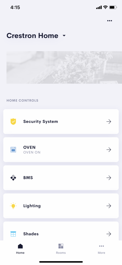
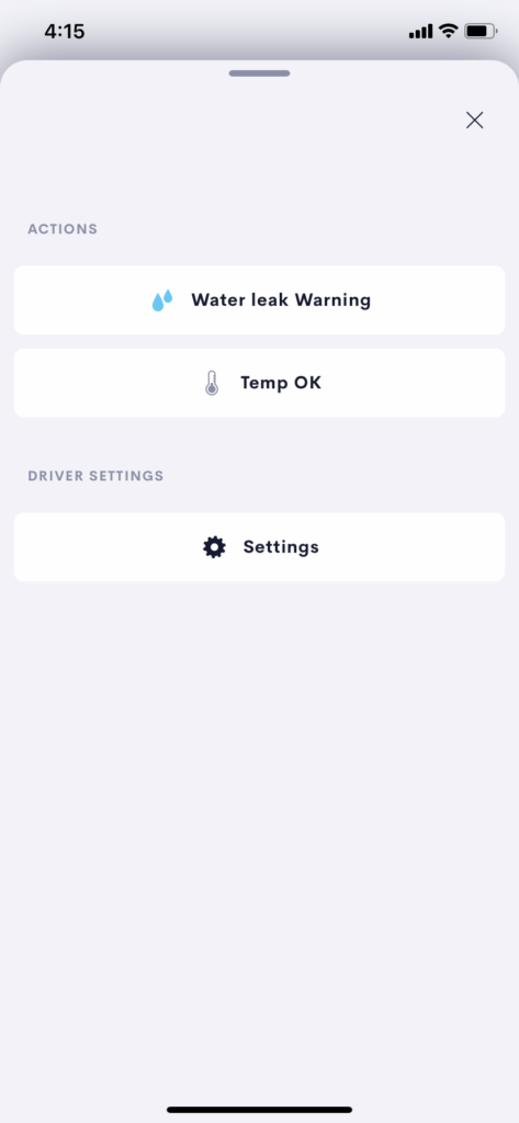
For Example you might somply want to display the states of BMS Warnings in the property:
- Displayed on the front page so users can at a glance check the status
- Customise the Alert Reporting Text to show the current Status
- Push Action on the button can be used to repoll the connected system
Sprinkler Example
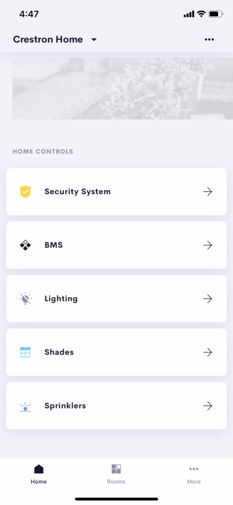
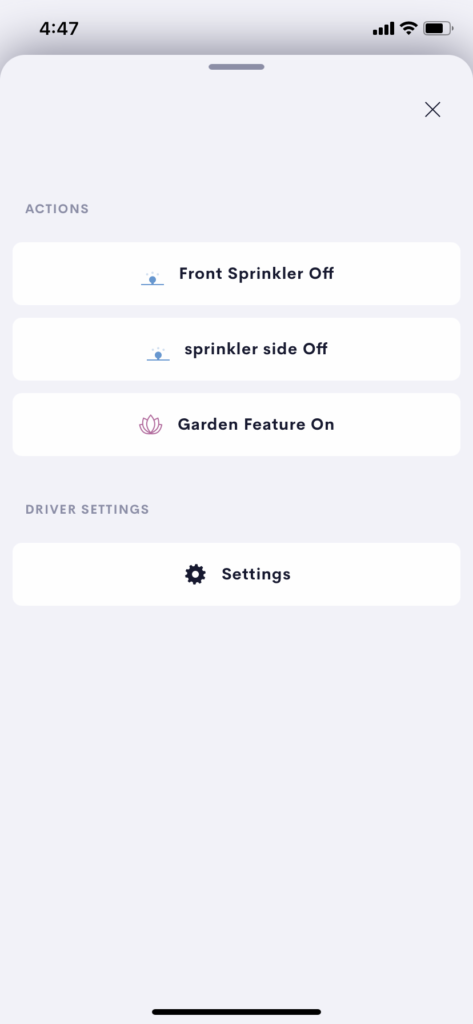
- Displayed on the front page so users can at a glance check the status
- Customise the Names of the controlled Sprinklers
- Group many Sprinklers into a single control
Setup
Using the Setup pages of the driver you can add and remove buttons and setup the naming and icons for each of the buttons you require.
The setup of the buttons is stored persistantly meaning once you setup a driver the settings will persist a reboot of the driver.
NB: Its also best practice to store a Gold cloud configuration when you are happy with your crestron home configuration and before and after making any changes.
Acces the setup pages as descibed here
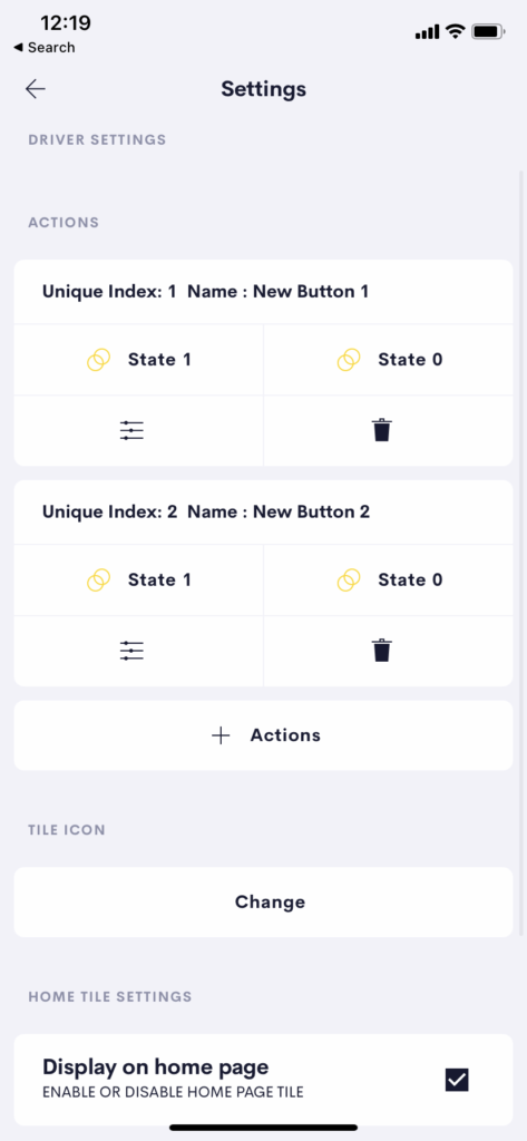
The Settings page shows all current buttons.
Unique Index and Name
The Unique Index is shown for each button. This is used when setting up your actions and events. The name is just added for your reference.
The Current Text and Image are shown for each state.
Edit and Delete
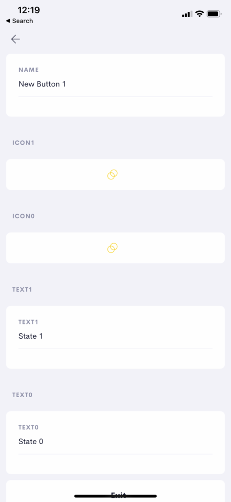
The Edit Button (Sliders) allows you to change the Name and for each state the icon and text.
Add Actions
This button allows you to add a new button and start editing.
Change Tile Icon
Click to set the Tile Icon. (Used in home and room Tile)
Disable/Enable on home page.
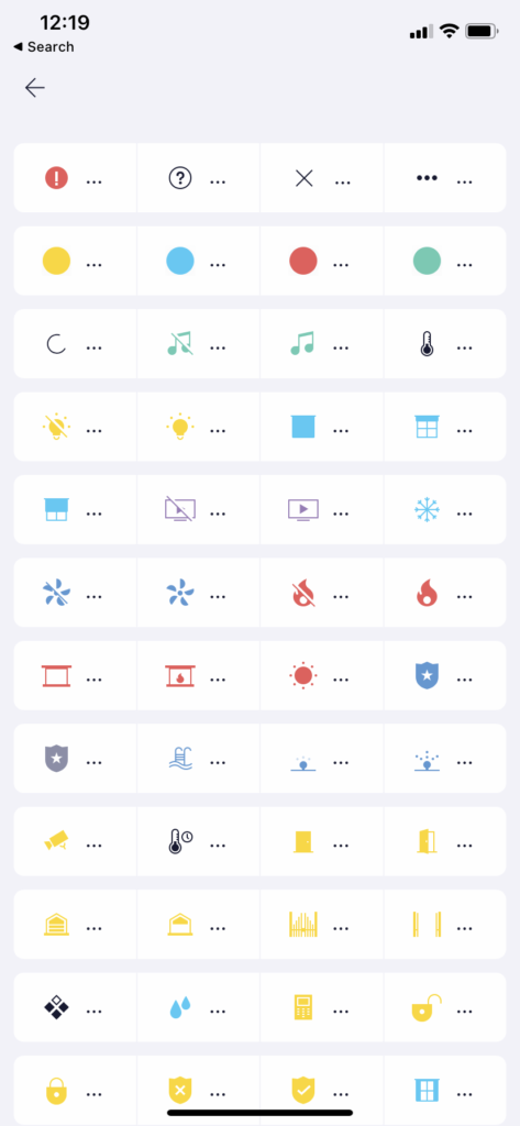
The Icon select page is shown when you click to change a state Icon or the tile icon.
Simply click on the icon you wish to use and the Icon will update.
NB: Icons only update on the User facing button once a state change has occured.
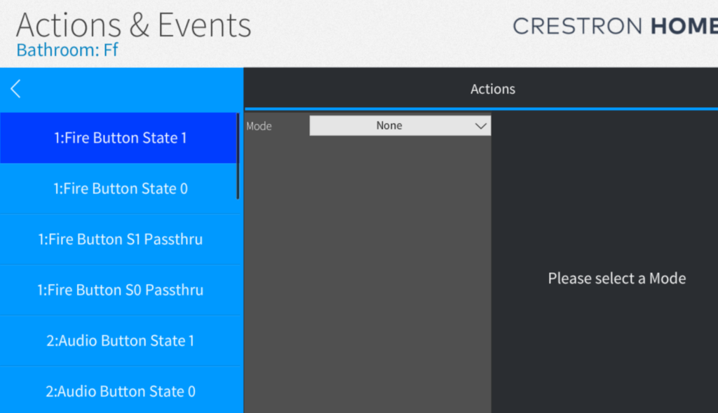
Events and Actions
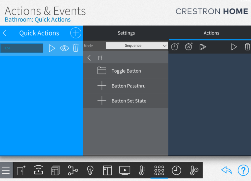
For each button four actions are exposed.
- State 1 (button State goes to 1)
- State 0 (button State goes to 0)
- S1 Passthru
- S0 Passthru
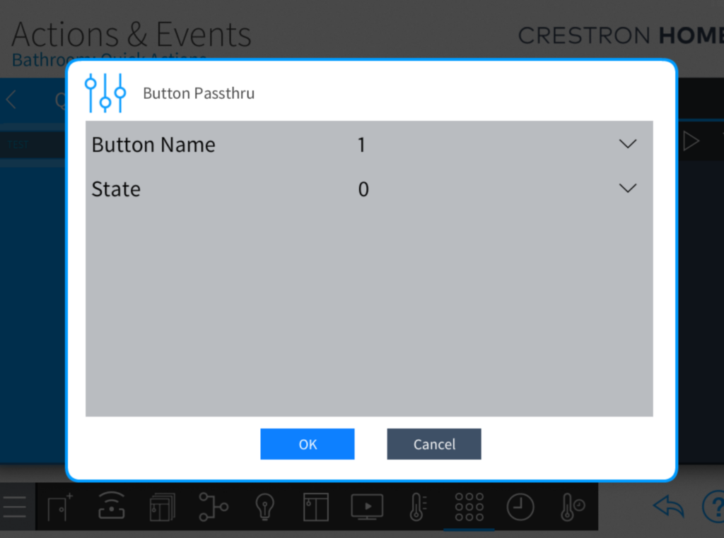
To see more about passthru events and Actions look at this article
