
- Customisable UI Tile
- Up to two, two state buttons
- Customise Icons and State Text on Buttons
- Customise and enable tile Icon (Update from multiple Buttons)
- Extensive flexibility of usage through events and actions.
- Show and Hide Buttons based on other button states.
- Passthru Logic Functions for each button state.
Build your own UI with custom Buttons with feedback.
Like Quick Actions but so much more!
Usage
Currently we offer two different dynamic button drivers , a single button and a customisable user interface which offers up to ten buttons on a single user interface page, both also allow the use of the room tile aswell.
These two drivers allow for a multitude of uses to control and monitor the state of devices, functions and controls. The possibilities are really endless.
We have documented many examples in our library of use case examples here
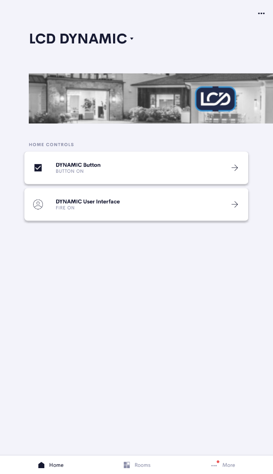
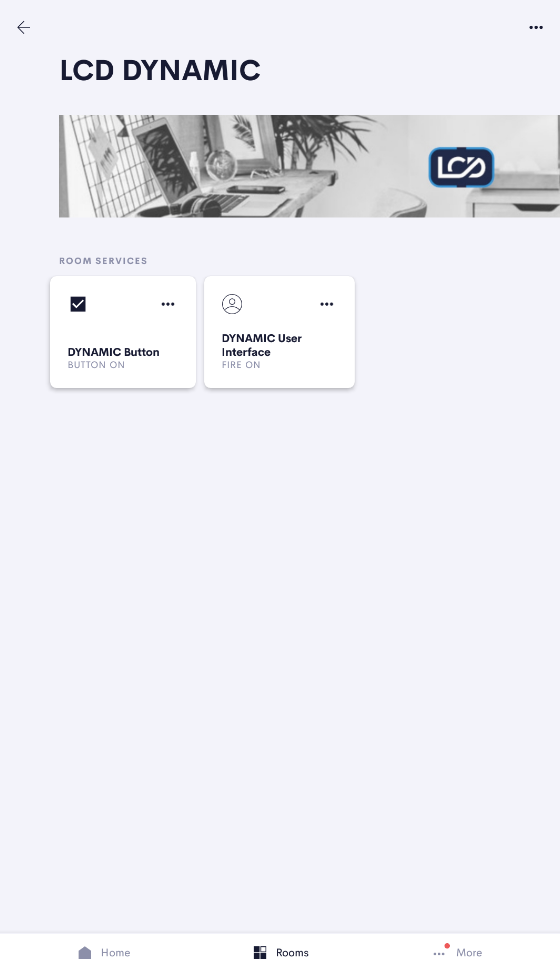
From a user perspective the user interface provides a tile element on the room page and/or home page and a button or buttons in the main user interface page.
These buttons display an on or off state which can be changed by pressing the button (toggle) changed by pressing the room tile. Or changed using the Actions and Events System in Crestron Home.
In addition to the above which is all configurable in settings, the driver exposes a number of settings, actions and events making the simple button a hugely powerful control element.
Each State allows customisation of the text and icon , In addition the room tile icon and text can be set via actions allowing effecively many states including error states to be displayed.
The buttons can be used just as a status indicator with no user interaction via the user interface. Setting the state using Actions allows the state of a device or system to be displayed to the user.
The buttons state can also be used as a in simple logic allowing you only to allow or to action certain events in your system if the button is in a certain state.
Setup
Using the Setup pages of the driver you can hide and show buttons and setup the on and off text and icons for each of the buttons you require. NB: Dynamic Button single only has one button although you can hide it if you want!
The setup of the buttons is stored persistantly meaning once you setup a driver the settings will persist a reboot of the driver. The available settings are detailed in the table below and can be found in the setting page of the driver. Acces the setup pages as descibed here
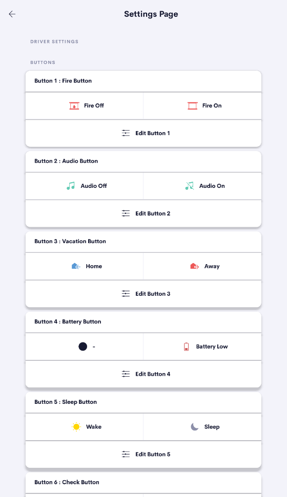
The Settings page shows all current buttons.
Unique Index and Name
The Unique Index is shown for each button. This is used when setting up your actions and events. The name is just added for your reference.
The Current Text and Image are shown for each state.
Edit
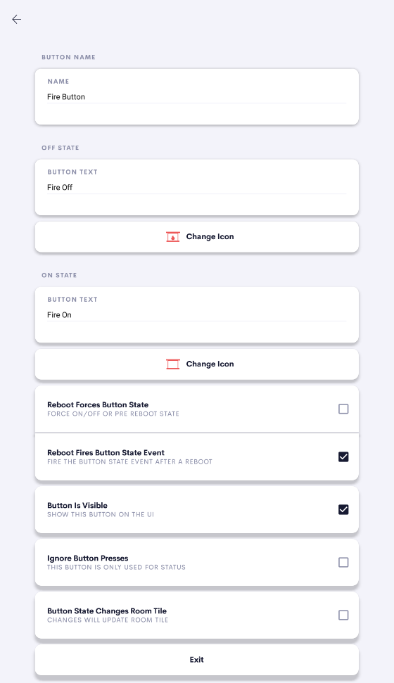
The Edit Button (Sliders) allows you to change the Name and for each state the icon and text. In addition all of the per button settings can be found in the button edit page.
The Per Button Settings are detailed in the table in the related section further down this page.
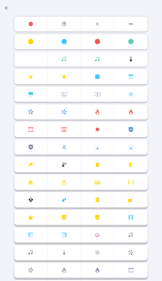
The Icon select page is shown when you click to change a state Icon or the tile icon.
Simply click on the icon you wish to use and the Icon will update.
NB: Icons only update on the User facing button once a state change has occured.
Settings (In UI)
| Setting Name | Description | Type | Notes |
|---|---|---|---|
| Name | Name of button only used for your own reference. | Text | |
| Off State Text | The text displayed on the button when in the Off state | Text | |
| Off State Icon | The Icon displayes on the button when in the Off state | Icon Selector | |
| On State Text | The text displayed on the button when in the On state | Text | |
| On State Icon | The Icon displayes on the button when in the On state | Icon Selector | |
| Reboot Forces Button State | Force the Button state Off/On instead of using the memorized state (State at shutdown) | Checkbox | |
| Reboot Forces Button Off State | Force the Button state Off after a reboot | Checkbox | Only visible if Reboot forces Button state |
| Reboot Forces Button On State | Force the Button state On after a reboot | Checkbox | Only visible if Reboot forces Button state |
| Reboot Fires Button State Event | Fire the Button State Event after a reboot | Checkbox | |
| Button Is Visible | Button is shown on the User Interface | Checkbox | |
| Ignore Button Presses | Button Presses on the user interface do not toggle the state of the button. Select if only using as a status button. | Checkbox | |
| Show User Warning | Shows warning on the user interface to warn user that button is ignored. | Checkbox | Only visible if button ignored |
| Button State Changes Room Tile | Any state change of the button will cause the room tile to display the same icon and text of the button in the new state. | Checkbox |
Events and Actions
Actions
| Action | Description | Parameter | Value | Parameter 2 | Value |
|---|---|---|---|---|---|
| Passthru Logic | Triggers the Button Passthru Off State event or Button Passthru On State event depending on the buttons state | Button | 1-10 * | State to Passthru | Test Both States |
| Triggers the Button Passthru Off State event only if the button is in an off state | Button | 1-10 * | State to Passthru | Only Test Off State | |
| Triggers the Button Passthru On State event only if the button is in an on state | Button | 1-10 * | State to Passthru | Only Test On State | |
| Set Button State and Event | Triggers the Button State Set Off event and displays the button in an off state | Button | 1-10 * | State to set | Set to Off State |
| Triggers the Button State Set On event and displays the button in an on state | Button | 1-10 * | State to set | Set to On State | |
| Toggles between the Button State Set Off event and Button State Set On event as well as update the button display state | Button | 1-10 * | State to set | Toggle the State | |
| Set Button State | Changes the button state to off without triggering the Button State Set Off event | Button | 1-10 * | State to display | Display as Off State |
| Changes the button state to on without triggering the Button State Set On event | Button | 1-10 * | State to display | Display as On State | |
| Set Button Visibity | Shows the button on the user interface | Button | 1-10 * | Visibilty to set | Show the button |
| Hides the button on the user interface | Button | 1-10 * | Visibilty to set | Hide the button | |
| SetTileText | This Event Sets the tile text from a list of available icons. This will be overidden by an icon from a button if enabled. | Text | Text to Set | ||
| Set Tile Icon | This Event Sets the tile icon from a list of available icons. This will be overidden by an icon from a button if enabled. | Icon | List of Images |
Events
| Event | Description | Notes |
|---|---|---|
| Button State was Set Off | This event fires whenever the button is set to the off state from the user interface or the Button Set To State action | |
| Button State was Set On | This event fires whenever the button is set to the on state from the user interface or the Button Set To State action | |
| Button Pressed | This event fires whenever the button is pressed on the user interface even if the Ignore Button Presses setting is enabled | This event always fires even is the Ignore Button Presses is setting is enabled |
| Button Passthru Off Logic | This event fires whenever the Button Passthru action is triggered and the button is in an off state | |
| Button Passthru On Logic | This event fires whenever the Button Passthru action is triggered and the button is in an on state | |
| Room Tile Pressed | This event fires whenever the room tile is pressed on the user interface | This event always fires even is the Ignore Button Presses is setting is enabled |
| Driver Loaded | This event fires whenever the driver is loaded, like after a reboot or if the driver name is changed | |